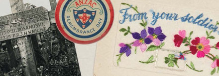
Flicking through Holding on to Home: New Zealand Stories and Objects of the First World War ($49.99, from Te Papa Press) is like taking a peek into your grandmother’s diary, with crumpled theatre tickets, love letters, a knitting pattern and other precious memories to be found between the covers. A closer look shows carefully curated objects from the Great War era, sourced by authors Kate Hunter and Kirstie Ross from museums and archives across the country. Each object has a story to tell about Kiwis’ lives during the war, from soldiers on the front line to families back home.
The book’s designer Anna Egan-Reid talks us through creating something bright and lively, while still respecting the struggles of war.

What was the design brief given to you by Te Papa Press?
?As the book is an object-led story, the main thing the authors wanted was for the objects and images to be the focus, so the images needed to run as large as possible. Beyond that, the brief from the publisher called for a look that is fresh and lively – an engaging design that has high emotional impact and appeals to women in particular. In an extremely crowded market, this book stands out for the fresh perspectives it brings to this conflict so the book needed to reflect this and not appear dry or academic.
The shape of the book gives it a personal diary feel. How did you arrive at this design?
We started thinking about the specs early on. The book needed to feel tangible and accessible, be undaunting, easy and lovely to look at, hold and to read. In the end we decided on a 2-ply board with a matte finish and a lovely, warm uncoated stock for the internal pages. We came up with the idea of the rounded corners initially because the design of the cover is based on the diary page of a little journal which had round corners itself. It took a little while (and a number of dummies from the printer) to finally decide on the specs but we think the rounded corners really make the package friendly and stylish.
We want to know more about your prominent use bright green and red in the book.
The colour palette was one of the hardest things to tie down. We wanted to avoid using khaki as one of the main colours, along with any cold or steely blues and greys. This book needed to be bright to stand out among the other WWI texts that will be released this year. In the end, the colour palette for the internal pages was based on a beautiful picture of a poppy that I found during my image research for the design. The green was taken from the stem of the poppy, the deep red from the centre of the poppy and the melon was from the petals. The green was lovely and rich so we used it on the endpapers and the cover too.
Font-geek time: give us the details.
For the body font, I went with the classic Fournier, which is delicate and easy to read. This worked well with the sans serif Whitney used in breakout boxes and captions. I struggled to find a good font for the headings that encapsulated the brief so in the end I decided to hand paint the titles. These were hand painted on a coarse card and then scanned. This worked very well as so many of the objects and ephemera are personal, many of them handmade or carrying labels, signatures or handwritten evidence of their owners. The hand painted titles tie into the era perfectly and are a nod to the nostalgia market. It also works beautifully on the cover in a way that every other font I tried didn’t.
And the outcome?
This design was one of the more challenging ones I’ve worked on. The brief called for a very fine balancing act of creating something bright, immersive and lively while still being respectful of the difficulties, struggles and horrors of war. I worked very closely with Odessa Owens, senior editor at Te Papa Press, and together I think we’ve managed to achieve that balance.